
As someone who has never taken the time to foster any artistic talent, I’m amazed at the skill of people who design book covers. I even tried to start a regular feature on this blog celebrating such endeavours, but couldn’t get enough people interested to go beyond two posts.
Given that recent years have seen an explosion in Golden Age reissues, I thought I’d draw attention to some of my favourite examples of cover art for these books. What follows are ten examples of Golden Age crime and detective novels reissued in the last decade whose newly-commissioned covers are, to my eye, simply wonderful.
So, by original publication date, we have…
1. The Wintringham Mystery (1927) by Anthony Berkeley
[HarperCollins, 2021]
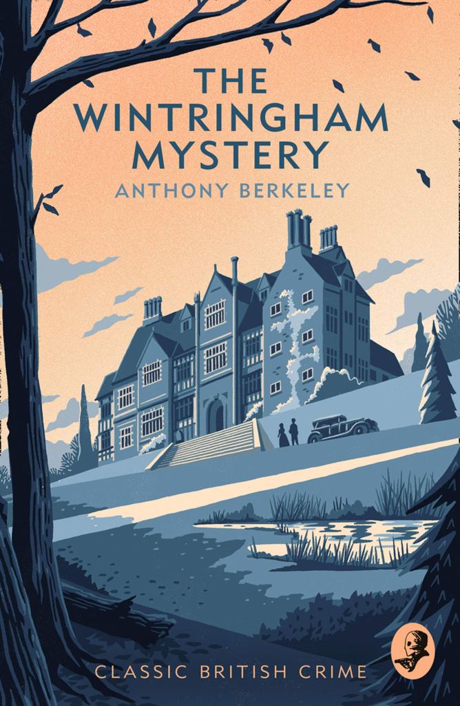
The combination of clean lines and contrasting colours of James Weston Lewis‘s illustration here manages to feel both elegiac and new, somehow capturing an almost sepia-toned sense of age that promises an older mystery without veering into redundancy because of its age. I love, too, the clear focus on the house, because The Wintringham Mystery (1927) is very much a country house puzzler in the classic tradition — oftentimes, perhaps because of the preponderance of cost-saving stock illustrations, a reprint can promise something the book never intended to deliver, but this nails the era and the style of mystery perfectly. And, all that aside, it would simply look great framed on your wall.
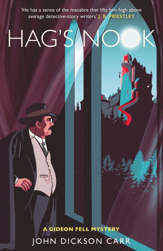
2. Hag’s Nook (1933) by John Dickson Carr
[Polygon Books, 2019]
As a general rule, I’m not a fan of people on my covers, certainly not recognisable renderings of them, and especially not recognisable renderings of a character as beloved to me as Dr. Gideon Fell. Abigail Salvesen limns everything so beautifully, however — that ominous prison (complete with narratively-accurate details!), the lovely use of red against the teals of the building to hint darkly at bloody goings-on — that of course she also gets Fell practically perfect as well. It’s the moon in the second ‘O’ of Nook that really makes this, though, for reasons I cannot honestly explain — perhaps in consort with the diaphanous curtains it gives a horror-like air to things…I dunno, but most fitting it is, nonetheless.
3. The Howling Beast (1934) by Noël Vindry
[Locked Room International, 2016]
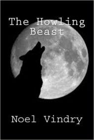
Like the Rue Morgue Press before it, Locked Room International’s covers are a mixed bag. This has the feel of a stock illustration, and certainly there’s no credit to an artist as there are in many of their other titles, but if it is stock then it’s the most perfectly-chosen and -constructed stock illustration on record. I’m a big fan of negative space in art, and this simple, clean silhouette leans into this principle, not over-complicating that which needs no complication. It seems almost inevitable in retrospect: if you hired 600 artists to draw a cover for a classic mystery called The Howling Beast (1934) I’m willing to bet 583 of them would draw some slight variation on this. That alone makes it damn near perfect.
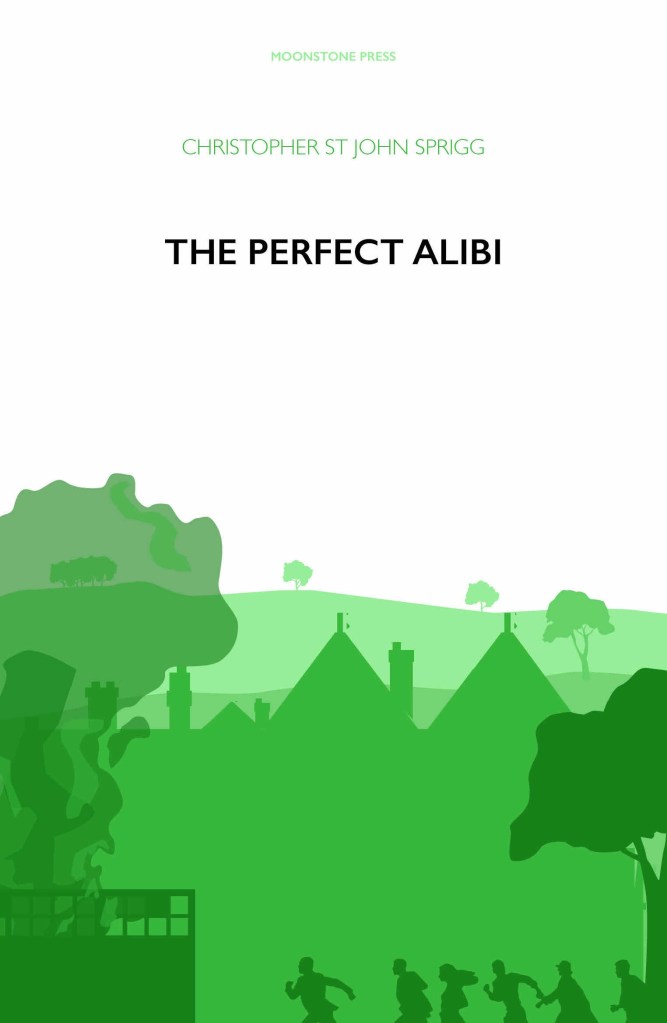
4. The Perfect Alibi (1934) by Christopher St. John Sprigg
[Moonstone Press, 2019]
The whole series of these Sprigg reissues from Moonstone, created by Chrissie Winter and Charlie Fischer, are superb, with artfully cluttered layering in the bottom half of each cover contrasting superbly with a blank upper half bearing just the title and author name. What I especially like about The Perfect Alibi (1934) is the disparity between the bucolic, almost calming green and the slow realisation as you take the image in that it actually shows people running in panic towards a fire. It’s a pretty bold choice to tell a story in this way with just the one colour, and to trust your audience to pick up on it without resorting to highlights or breaking the monochromatic texture of it all. In my uncultured opinion, it pays off here in spades.
5. Death in the Tunnel (1936) by Miles Burton
[British Library Crime Classics, 2016]

Before the British Library had the ingenious idea of using — sometimes, it must be said, rather bland — old posters for its Crime Classics covers, it commissioned several new pieces of art from Chris Andrews. This one for Death in the Tunnel (1936) is easily my favourite: a classic train mystery setup, the title promising something terrible once the locomotive passes from that lonely stretch of track and out of sight. I like the subdued colour palette here, too, giving things an ominous overtone without leaning too hard into it, the light on the front of the engine being swallowed by the burrow-like darkness. My mystery-loving fingers positively itched with anticipation to open the book when I first saw it, and I get the same shivers to this day.
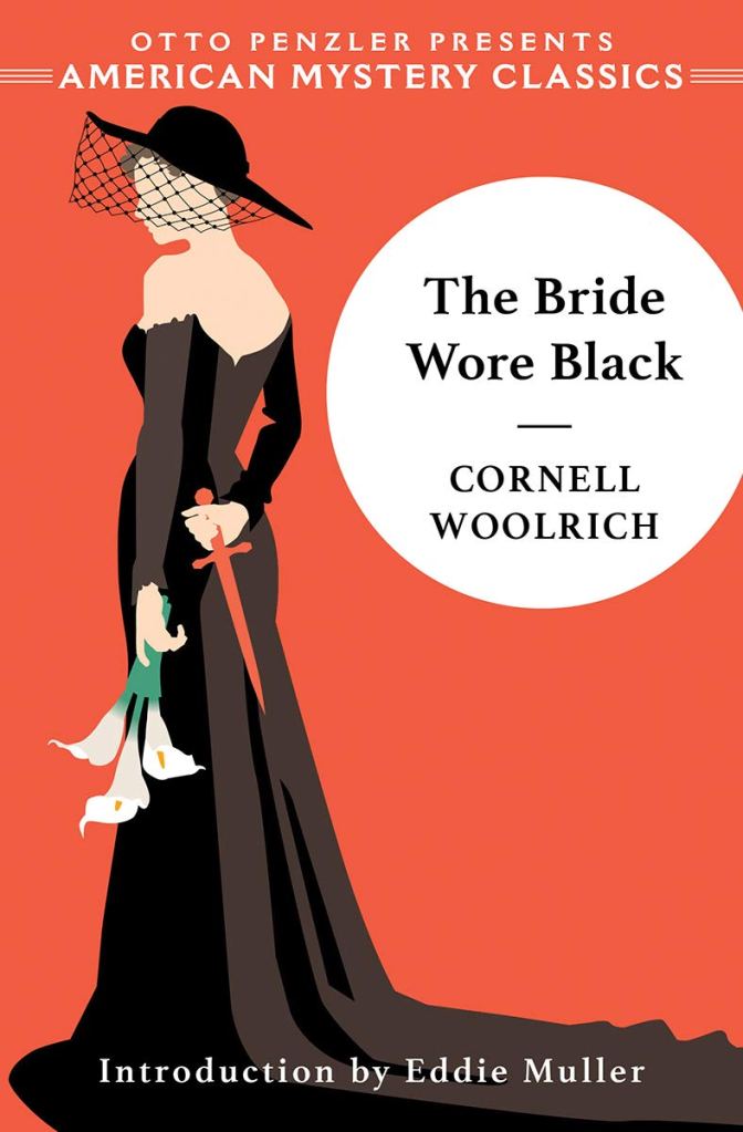
6. The Bride Wore Black (1940) by Cornell Woolrich
[American Mystery Classics, 2021]
There’s a lot going on in the deceptively simple cover for The Bride Wore Black (1940). Andy Ross manages to capture the inherent femininity and sympathetic air put out by the eponymous bride, and through simple colouring draws your eye to the dagger behind her back that represents her true intentions. The sense of vulnerability and manipulation which is so central to the plot positively oozes out of this, and again benefits from being told in such a simple manner. Ross used similar iconography in the cover for Waltz into Darkness (1947), too, but the simpler colour scheme here makes this hit harder. I legitimately take this book off my shelf just to look at the cover every so often, so much do I love it.
7. The Honjin Murders (1946) by Seishi Yokomizo
[Pushkin Vertigo, 2019]
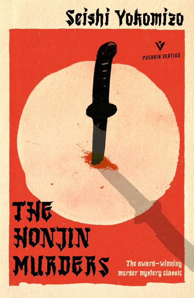
Anna Morrison‘s striking designs for the Seishi Yokomizo reprints put out by Pushkin Vertigo all feature the simple iconography of a circular patch containing some object that is relevant to the plot. Before we realised this was going to be a feature of these books, however, the superb choices here — the inversion of the Japanese flag enabling the rendering of the patch of snow into which that bloody blade is thrust in the book, with nary a footprint to account for its presence — made The Honjin Murders (1946) compelling from the first. The pair of legs stretching upwards on the cover of The Inugami Curse (1951) almost made it on here instead, but the freshness of this still just about wins out for me — a strong opening salvo for a superbly adaptable series of covers.
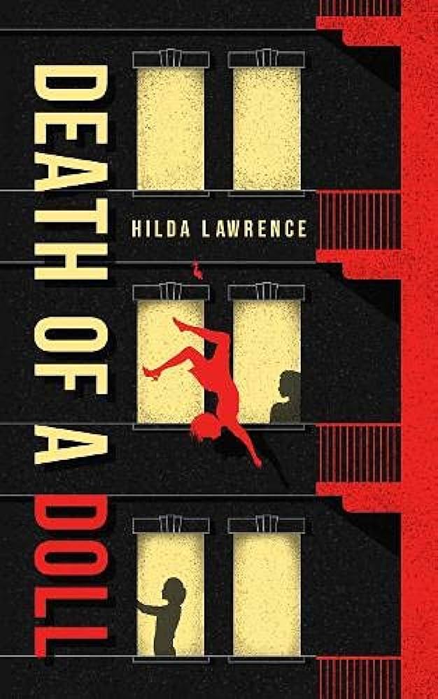
8. Death of a Doll (1947) by Hilda Lawrence
[Agora Books, 2019]
A great cover makes you want to grab the book immediately, and this exceptional use of layering and contrasting colours from Mad Studio made me exceptionally eager to do that well before I knew anything about the plot or Hilda Lawrence’s writing. It’s the great study in contrasts here again that appeals — I love the people unknowingly going about their lives behind the windows while someone plummets to their death — and little touches of the shadows and the shoe that’s come off as our victim falls are just the icing on the cake. Does a good job of giving a sense of an older mystery, too, which is something I’m keen to see retained in my cover art for old mysteries — the situation could come from any era, but it feels Hitchcockian and lived in. No mean feat.
9. The Tattoo Murder (1948) by Akimistu Takagi
[Pushkin Vertigo, 2022]
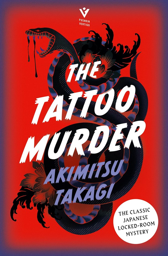
You’ll find at one of the links above Jo Walker‘s thoughts on how this particular composition took shape, and — quite aside from her generosity in writing about this for the blog — I honestly think this might be my favourite of all the covers here. Takagi’s novel delves deep into the tattoo subculture of post-WW2 Japan, and this cover promises terrible, threatening things while also playing up to the ‘tattoo’ in the title. The letters being partially lost within the coils of the snake is a lovely touch, too, and provides such a magnificently eye-catching display that it’s difficult not to feel like it should be used on a far better novel. This really does illustrate the value of commissioning new covers, and everyone involved is to be heartily commended.
10. I Married a Dead Man (1948) by Cornell Woolrich
[Penguin Classics, 2024]
Something about Cornell Woolrich’s sense of dread lends itself to great covers, I feel. This is the one book on this list I haven’t yet read but, where some of these new Penguin Crime and Espionage covers get a little too busy or push too hard to make their point, the simplicity of this — and the conjuring to mind of the expression dead man’s shoes — is wonderfully balanced by the artist (whose name I’m yet to discover). I’d never wear brogues myself — good heavens, I’m not a savage — but the detail on the toes and the little touch of green laces to tie into the Penguin colour scheme shows a clear-headedness where such uncomplicated iconography could instead appear merely uninspired and passive. Simple, memorable, haunting, brilliant.

~
So, yes, what a wonderful time to be a fan of Golden Age crime and detective fiction: not only are we positively drowning in high-quality reprints, we’re doing so at an time where the very talented people above — and plenty more besides — are being brought in to give new, vibrant life to these titles. I will never tire of high-quality cover art, and I remain hugely impressed by and grateful to the people who have taken the time to develop the skills that make all this possible. Kudos all round, keep up the excellent work!
~
My Ten Favourite…
- …Literary Detectives
- …’New to Me’ British Library Crime Classics
- …Ramble House Novels
- …Impossible Crimes
- …Locked Room International Titles
- …Golden Age Reprint Covers
- …Orion Crime Masterworks
- …Mysteries of the 1930s
- …Mysteries of the 1940s
- …Paul Halter Translations
- …Juvenile Mysteries
- …Inverted Mysteries

Nice choices. I’m familiar with most of them (through ownership), but the Hilda Lawrence is a cool surprise, even nicer than Blood Upon the Snow. I do love how the small presses especially go boldly forth where no one has gone before. Like LRI, not every cover in the Ramble House list nails the mark, but I’m always impressed by their bold lunacy.
LikeLike
Not judging a book by its cover is a cliché for reason, but a well-done cover enhances the reading experience for me. Your choices are good ones.
While I am here, can I wish for old Dell mapbacks to be reprinted? Whenever I find a used mapback at a decent price, I can’t help but to buy it as I am fascinated by most of those front and back covers.
LikeLike
I’d like to see an entire post dedicated to explaining the cover of The Devil Drives.
LikeLike
Nice list, some good choices there!
I won’t rule out the British Library poster covers entirely – when they fit the setting and atmosphere of the book they can be great! I particularly like the two Paris-set Carrs – the lurid colour of It Walks By Night and the moody silhouette used for Waxworks. Any London-set book, particularly a wartime one, is spoilt for choice on atmospheric images.
Though I’m not 100% a fan of the books, I like the covers on the Nicholas Blake reprints. Sadly my copy of The Beast Must Die does not bear the most recent reprint cover which I think looks great. I like a good abstract cover.
See also the covers for Moonstone Books – the St. John Sprigg ones are nice but the new more colourful ones are really distinctive and have a great style to them.
I’m less a fan of the American Mystery Classics style myself. The art is… I don’t know… too clean. I’ll give you The Bride Wore Black though.
LikeLike
Great post Jim! I’m not a fan of the LRI approach I’m afraid, including the one posted here, but you really do have a lovely mixture of recent covers here.
LikeLike
Coincidentally, the day I read your post I saw the Green Penguin reprint for “I Married a Dead Man” in my local bookshop. I am glad that I decided to buy it.
I am not as well read with Woolrich as you are, but I really liked, “I Married a Dead Man”. Normally, I don’t enjoy such a depressing, morose style and the plot is a bit contrived / improbable, but the lead character trapped in a vortex of desperation and inevitability leading to a powerful conclusion (no spoilers here) made for captivating reading. This is one of those haunting books where I won’t forget how the book made me feel reading it. Recommended.
LikeLike