You may remember — and I won’t blame you if you don’t — that back in October 2019 I was lucky enough to get cover designer Abi Salvesen to explain her process in researching and creating the covers for two John Dickson Carr reprints put out by Polygon Books.
As I said at the time, I’m fascinated by cover art — it forms such a huge part of the relationship we have with a book — and I had optimistically imagined that Abi’s post would be the first in a series where artists were able to draw attention to the excellent work they had done on our behalfs.
Well, man plans and God laughs, and the series never took off as intended. And then, a month or two ago, I came across the amazing cover for the Pushkin Press reissue of The Tattoo Murder, a.k.a. The Tattoo Murder Case (1948) by Akimitsu Takagi, a novel which offers both a locked room murder and a fascinating glimpse at the subculture of tattoos in post-WW2 Japan. And, with this new version book having been released just a few days ago, I’m delighted to say that artist Jo Walker agreed to give us another glimpse into the world of creating these magnificent covers.
And so, enough from me, over to Jo.
~
When I read the brief for The Tattoo Murder, I knew I was going to enjoy this project. The description of the book ‘A gruesome classic locked room mystery set in the exotic underworld of Japanese tattoo culture’ let me know I’d be in for a treat!
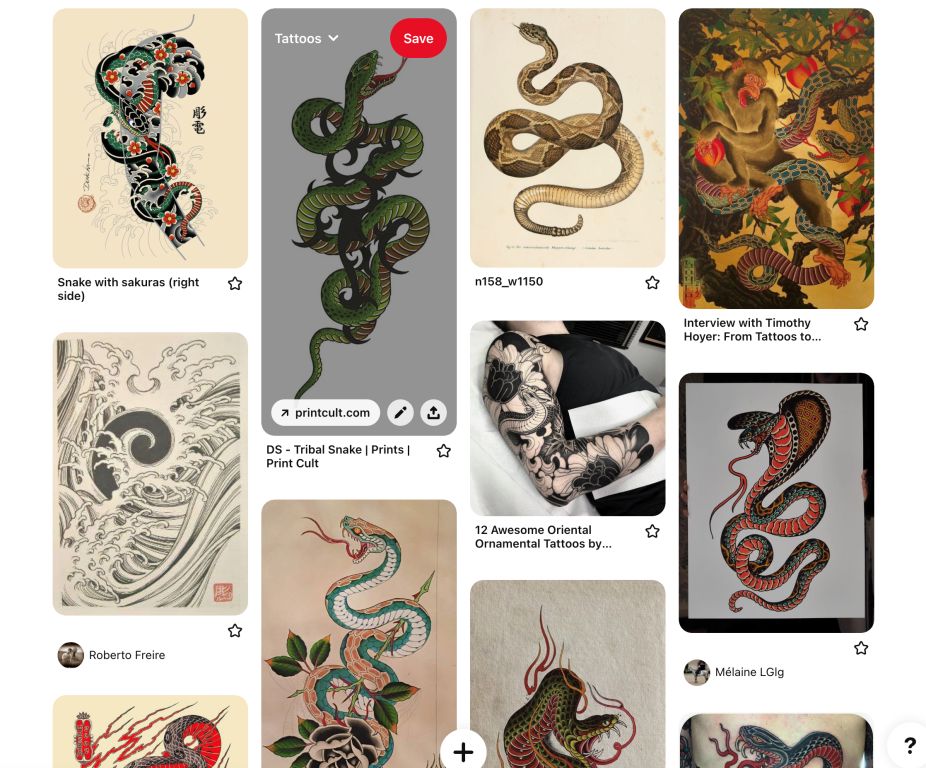
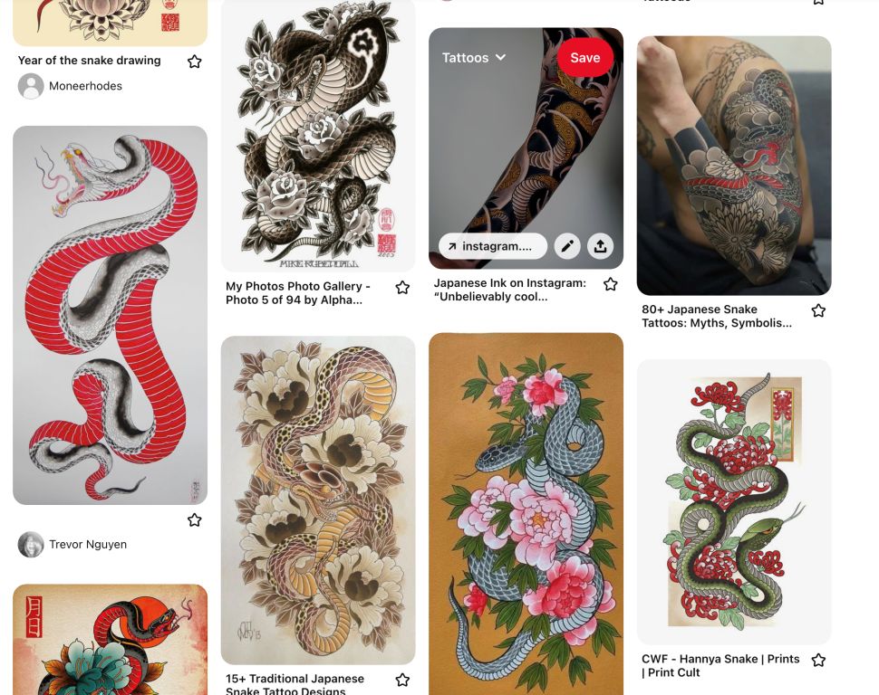
I started off by researching traditional Japanese tattoos. Each tattoo has a meaning to the individual and shows something symbolically important to them. Kinue Nomura, the woman murdered in the book has a full-body snake tattoo and it seemed like this was the obvious choice for the jacket image.
I did a lot of research and gathered images of snakes, snake tattoos and beautiful tattoos in general as inspiration. I had two routes in my mind – one to show the full snake and one to show a close up of the scales of the snake, leading to a simpler, bold typographic jacket [click any of the images in this post to see a larger version]:
There wasn’t much of a description of the snake in the book, but the editor Daniel explained it was from Japanese folklore – the sorcerer Orochimaru, who is depicted by a giant snake.
There have been jackets with tattoos on before – The Girl With the Dragon Tattoo being the most notable – but I wanted to avoid copying this look and give this more of a mysterious feel, so I set to work and created some visuals.
I started off by using Illustrator to create the initial snake illustration and then brought it into Photoshop to add texture and create a more ‘tattooed’ feel. I have to admit at one point I was tempted to get the tattoo done so it would look authentic, but then I realised that might be going a bit too far…
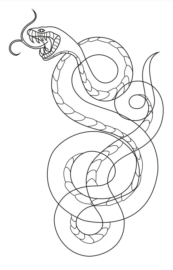
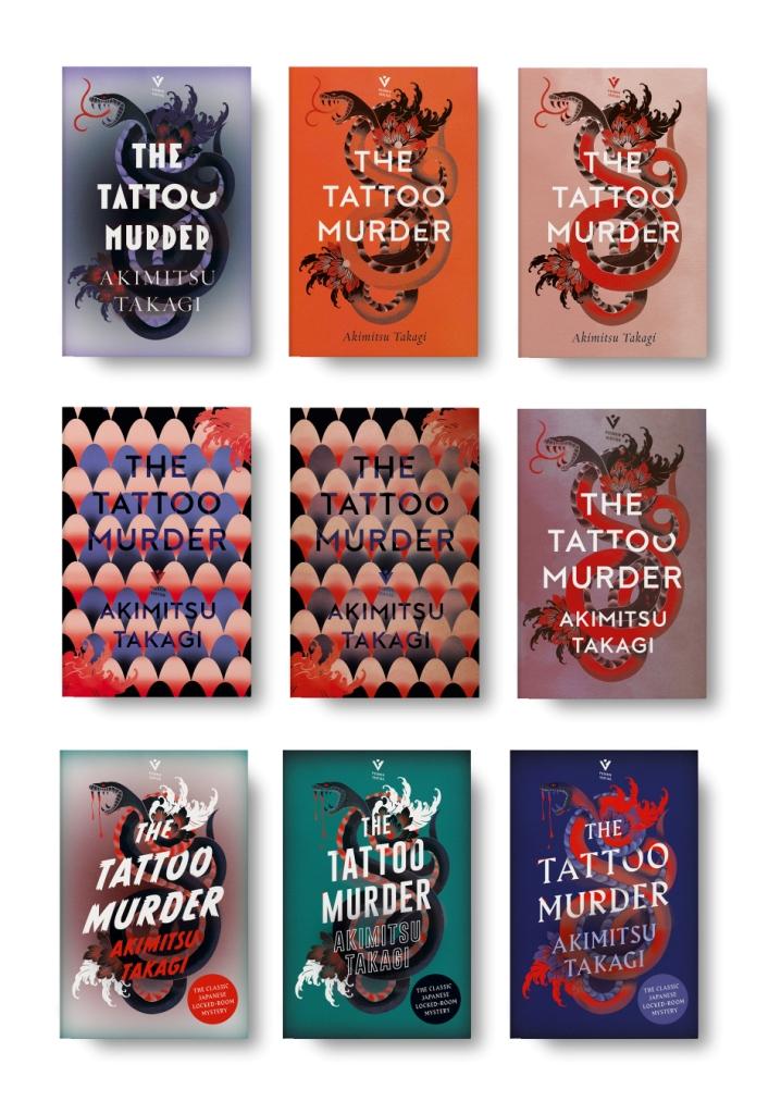
I wanted to show a few different typographic options, and felt the first in this set was the most successful. I really liked the snake scales options, but it was felt there were legibility issues and to get around that, I don’t think the cover would’ve been quite as bold and striking as we wanted, so I scrapped that idea and concentrated on the full snake.
One comment was that the type wasn’t quite right for this jacket, the editor wanted more of a Japanese feel and it needed to be a bit more dynamic. He also wanted a bit more gore, possibly having some blood dripping from the snake’s fangs, so I created more options with that in mind:
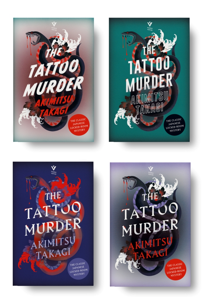
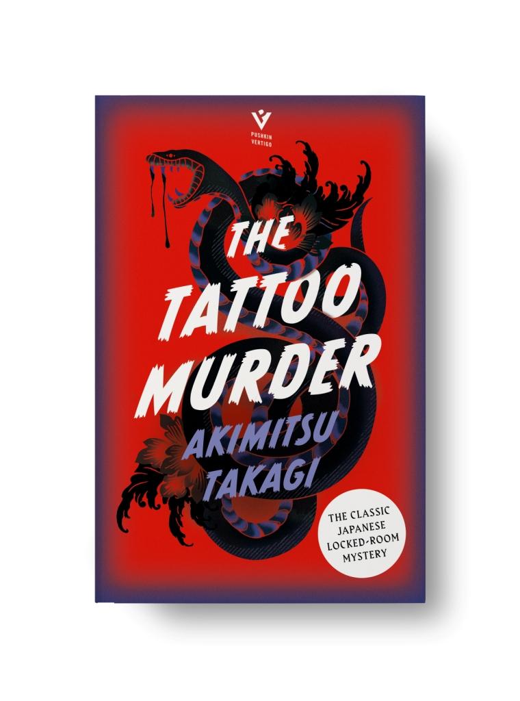
The top left jacket was chosen, but I wanted to play around with the colours to make it really punchy and reflect the mood of the book. I was really happy with where we ended up and thoroughly enjoyed the whole process. It was such a great brief to work on, I felt very lucky!
~
My thanks to Jo for putting her talents to such good use and creating a magnificently striking piece of art to adorn this book, as well as to Pushkin Vertigo for their continued excellent efforts in making so much classic era Japanese detective fiction so readily available to English-speaking audiences — we have them to thank for the ongoing Seishi Yokomizo translations, as well as the likes of more Yukito Ayatsuji on the way with The Mill House Murders (水車館の殺人) (1988) coming next year.
You can find more of Jo’s work on her website, Instagram and Twitter.
You can keep up with the news from Pushkin Vertigo on their website, Instagram and Twitter.
And here’s hoping it’s not another three years before I’m able to do this sort of thing again, eh?

Like you and other bloggers I respect, I have a fascination for cover art on detective fiction with a particular weakness for old Dell mapbacks and Popular Library mysteries. Holding a treasured GAD work with a great front and back cover enhances the reading experience for me. That is why I prefer an actual book unless reading an ebook version is my only choice.
The cover art on this well done, but I have not pursued The Tattoo Murders given the middling reviews of this from you and TomCat respectively in the past.
LikeLike
It’s a middling sort of book, I won’t deny, but this edition looks so wonderful that I’m sorely tempted to buy it again just to have such an attractive book in my collection.
LikeLike
Dell Mapbooks had wonderful covers. In those days book cover art was almost always excellent, and fun. The decline seemed to really set in in the 80s.
LikeLiked by 1 person
That was fascinating, and what a great idea to investigate it. I don’t remember the previous post – you will have to do them more often to keep them in old people’s memories! But I went back and read it, and it was equally fascinating, especially as in that case I was veyr familiar with the books concerned.
LikeLike
I had one more lined up pre-COVID, but it all sort of fell apart once the pandemic kicked in…but, not to worry. Now that Abi and Jo have so kindly given their time and insight I’m hoping I’ll get a bit of momentum behind this — not least on account of the wealth of reprints we’re enjoying at present — and be able to follow t up with something else before too long. Watch this space…!
LikeLike
I have a soft spot for the option on the top right where the background resembles skin color, making the cover looks like a real tattoo, but I do love the final cover. The strong contrast against the red background is so striking and ominous! Great walkthrough, Jo!
Thanks Jim, this really is a wonderful idea for a series! I just reread the Abi Salvesen post as well. It’s pretty enriching to see the artist’s process, and it gives a space to celebrate them and appreciate their work. I’ll watch this space for more as you say above. This is tempting me to revisit the book
LikeLike
Keep the cover art posts coming, it’s definitely a fascinating topic. I imagine that many of the artists from what I consider to be the classic period (40-60s paperbacks) aren’t still around, which is a shame, as I’d love to know the thought process that went into some of them. I’m curious how often covers were just picked out of a catalog of existing illustrations (and perhaps augmented), as opposed to something bespoke being created.
LikeLike
I hope to feature more of this sort of thing, because I — and, I’m sure, others — find it a fascinating window on a world that runs the risk of being taken for granted most of the time. Hopefully I’ll get a little momentum behind this now, so if any cover artists have worked on classic detection reprints in the last ten years…get in touch!
LikeLike